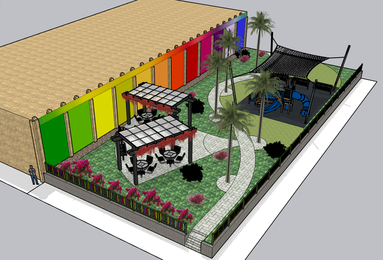
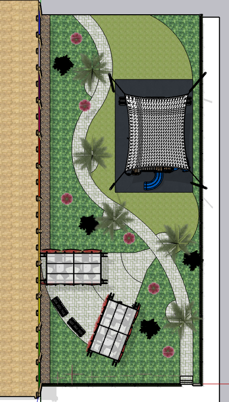
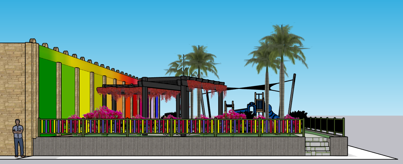
Rio Grande City is a City in Southern Texas that we worked with in graduate school. There was a lot of local culture that the residents wanted to celebrate, but found themselves at odds with the municipal government (who was mostly interested in economics). A number of vacant lots were available around the city, and I wanted to envision how they could be used for something other than yet another fast food chain.
This lot stuck out to me for several reasons. It was right across from a locally-owned cafe; it was covered in turf grass and nothing else; and it connected to a second lot with similar characteristics (and thus was ripe for adding on to the park at a later date, or simply being used as-is. Children don't need more than a ball to turn an empty field into a favorite play-spot). Southern Texas gets unbearably hot in the Summer, and this area of Rio Grande City lacked green space, shade, and even just a place to sit and rest -- all necessary for surviving the 100F+ August afternoons. Not to mention, public space was at a premium; children and adults both lacked public amenities.
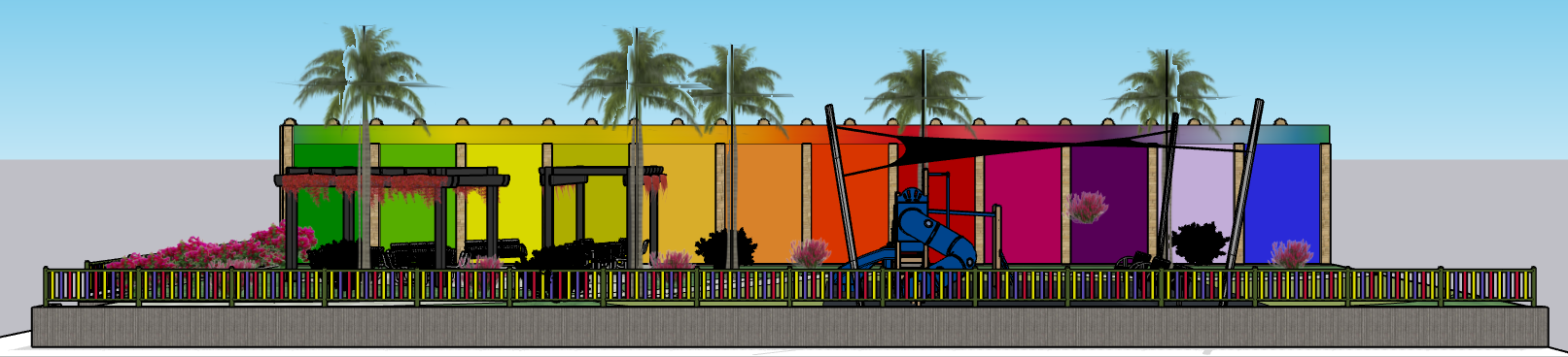
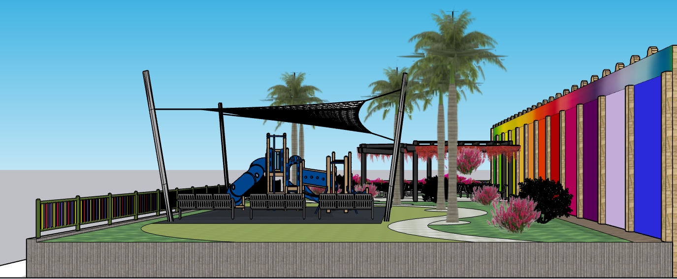
The park is designed to visually evoke the winding wisteria that thrive in Texas. A combination of fence and native plants push residents back from the street (creating a feeling of safety - proximity to traffic is a known deterrent for people spending time outdoors). The native plants are easy to maintain. Tall trees and cloth shades keep the sun off your back while playing in the play area or sitting at the tables. Grab a drink from the cafe across the street and read a book, or watch your kids without fearing immediate sunburn.
Rio Grande City has a small but thriving art scene that the locals wanted to emphasize. The splashes of rainbow color along the wall are a placeholder; I imagine that space would serve as canvas for one or more murals thrown up by local artists. The colorful fence could work likewise.
The path which terminates at the park's North boundary leads to the second lot I mentioned before. The grassy field beyond the path could be kept as-is, or grown into a new park.
What would I do differently? First and foremost, the park is not particularly accessibly for people with mobility issues. The lot itself only has two formal entrances - one up a small flight of stairs, and the other over a grassy field. Neither of these are particularly useful to a person in wheelchair, or a scooter, or someone who struggles with balance... an obvious oversight. An improved version would take care of this with a ramp, or by absorbing the second lot to the North to create easier access.
Second, the main (well, only) path through the park is not particularly wide, and is therefore not particularly accessible either. An updated park would need to see that path widened by a few feet, minimum. The lot itself is not particularly big, so a balance would need to be struck. Some of the native ground covering could be replaced to allow more space for the designed elements. Of course, I wouldn't wannt too much of it removed - bringing some of nature's beauty back into the city is the point!
The Chemistry Plaza was one of my two final projects for graduate school. I selected two plazas in the center of campus to study, the old-fashioned way: I sat on a bench with a notebook and a clicker, recording how many people used the space, where, and how. The other plaza I selected seemed well-suited for how the students used them; the Chemistry Plaza did not. And so it became my focus.
This plaza proved to be a favorite spot to pass through, but not a destination; despite the central location and lovely fountain, very few people could be found sitting in the plaza at any time. After a little study, it became clear that the space with missing significant amenities: first, there was next-to-no shade corresponding to seating areas. The most attractive seating areas were a pair of benches situated under the largest shade tree. These two benches also had the benefit of being among the only seating spots against a spatial edge - many of the rest left your back exposed to high-traffic through-ways. The only other seat along an edge sat within a false enclosed area, which negated sightlines to the rest of the plaza and allowed people coming Southward to watch you from a raised area without you necessarily seeing them. As you can imagine, it was mostly men who used this space.
Speaking of gender, the space had almost no lighting. While this isn't probably in the middle of the day, you can predict that usage by women will be drastically lower in the evening or night. And the data bore that out: despite the large amount of traffic moving through the space, the proportion of women dropped significantly come sundown. The plaza simply did not feel safe to even pass through, let alone sit in.
While poor seating is a problem for any public space, a space for students suffers doubly if there is nowhere for students to study! And these days, that means tables, if not tables next to electrical outlets. They did not have a single convenient surface for writing, or placing books, or setting a computer. I spotted a few students making due, as students always do: setting themselves up awkwardly on low walls or near planters, but it was clear the situation could be improved drastically.
Finally, the fountain itself presented a problem of intention-sigaling. Several design qualities gave mixed signals: the strange step-pyramid-like design made the rim of the fountain difficult to sit on, both because it was too high up and because the steps were too small to get a foodthold on, leaving your feet to slip constantly if you did manage to climb up. This may tell you that the fountain is not meant to be sat on, yet several benches were built directly into it - where the pyramid-like walls rose above you, obscuring all view of the fountain. So you could see the fountain, or you could sit at the fountain, but you could not easily do both. Finally, the lowest pool of the fountain had steps leading directly into it, as though inviting people to dip their toes in. ...except that same pool had the pump equipment in it, which tells a person not to use it. These problems manifested in visitors of all ages awkwardly milling around the central landmark of the plaza, unsure of what to do with themselves.
Obviously, this was a space ripe for a redesign.
In addition to solving the above complaints, I wanted to make the plaza more accomodating for neurodivergent individuals: those living with Autism, ADHD, and/or OCD, specifically. While all three of those conditions have a wide variety of factors to consider, many of which are contradictory, there are certain elements that can be included to improve the quality of life for a good portion of the population.
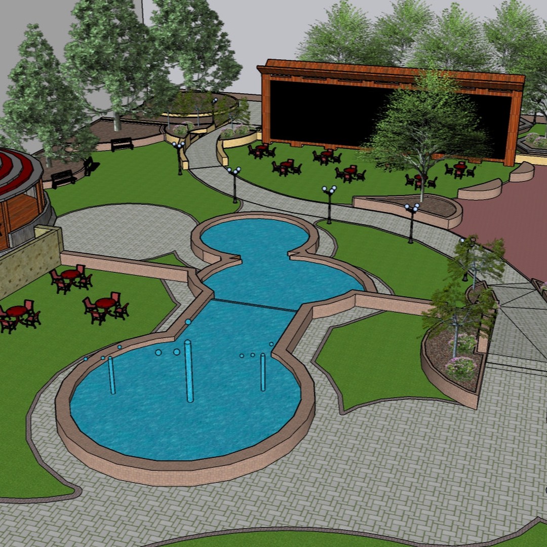
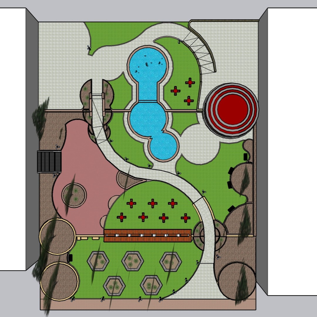
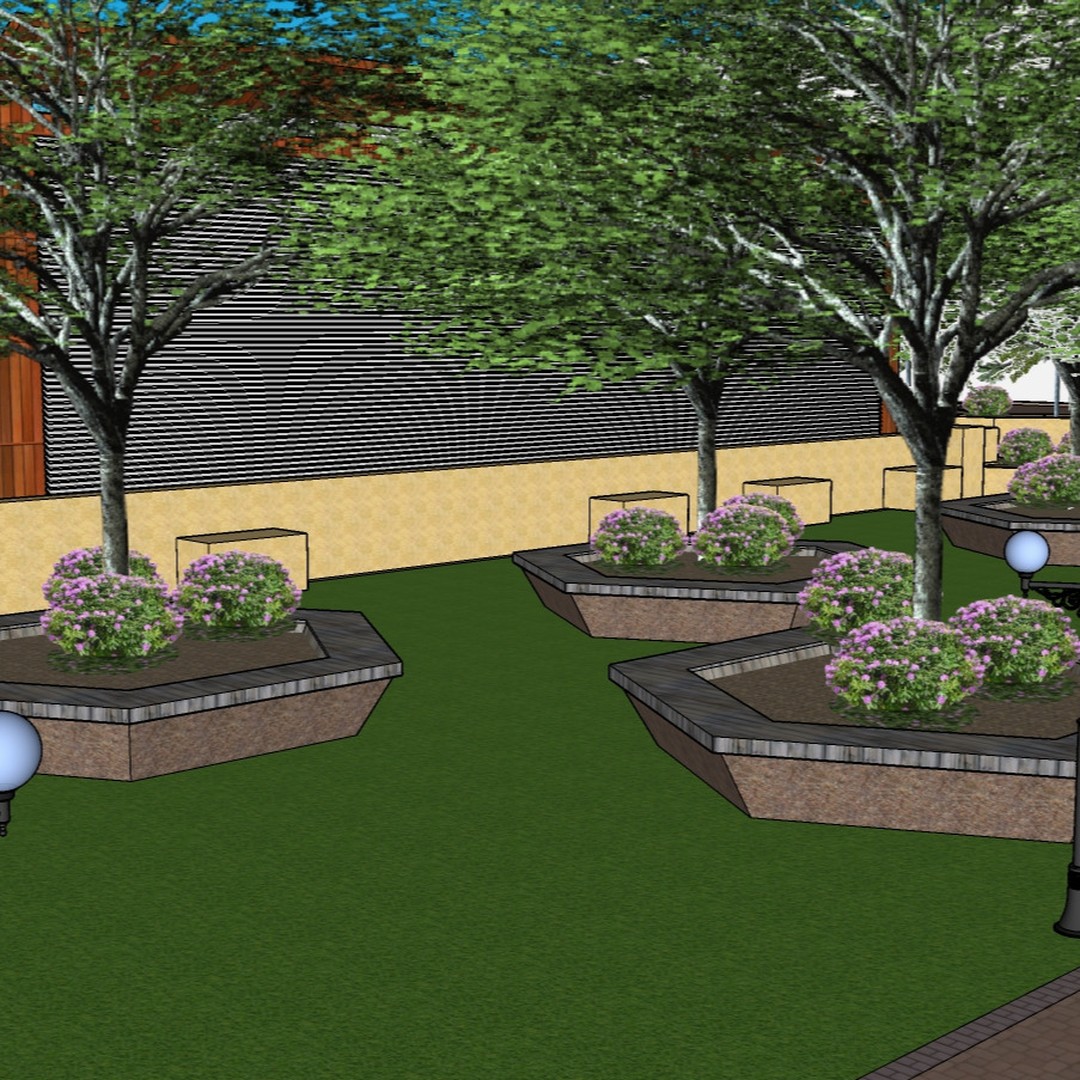
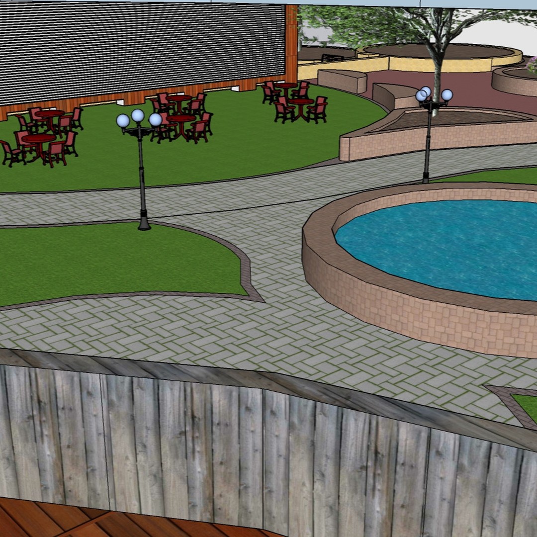
Click on the thumbnails for a better view of the model.
The North edge of the plaza and the South edge of the plaza were at two entirely different elevations, which had to be taken into account. I started by dividing the plaza into three stepped tiers connected by a main transit path, which follows the walking route taken by the majority of users. These paths use gently-sloping ramps rather than stairs, not only for added accessibility, but because students transit by bike as often as they walk.
Each tier of the plaza is designed for slightly different uses, and takes into account the sensory environment immediately surrounding it. By dividing the space into sub-spaces with different sensory expectations, then signaling the space differentiation through a combination of elevation and materials, we create an environment where visitors can have a general understanding of how to engage with each space. This is especally important for some autistic visitors, who can become overwhelmed not only by sensory stimulation but by a lack of context.
The lowest-elevation tier - the "lobby," if you will - is designed as a gathering space. As it is closest to the road, this tier is subject to more noise, more light, and more foot traffic. It's not a great area to sit for an extended period of time, but it is a great gathering point for meeting your friends. To this end, the "lobby" tier uses shaded, heagonal tree planters lined with bench seating to invite meeting, gathering, or just sitting.
This tier also introduces two of our neurodivergence considerations. At the wall dividing the "lobby" tier from the next one up, several cement blocks rest. These blocks are ostensibly seating, and likely will be used as such, but they have a second, secret use: perching and climbing. Climbing is simply a fun way to get from place to place, and many people living with ADHD find themselves doing so impulsively when given the opportunity. Both Autstic & ADHD people are more likely than their neurotypical counterparts to engage in "perching" behavior, as well - a tendency to "get the high ground" and squat or sit on tall objects. The cement benches are positioned such that they allow this sort of behavior.
The second consideration comes in the form of a large screen. Combined with the trees and other plantlife, this screen creates a sound barrier between the central tier and the activity of the "lobby." The large screen can also be used to project movies or other images during night-time gatherings; a built-in outdoor movie theater that also works to control the sensory environment!
The central tier is the largest of the three. It has wide lawns for gathering, playing, and resting; open space and shade, both; abundant seating, both along the edges of the space and at numerous tables on the main lawn and in the "study cave"; and the lower part of the fountain. The "study cave" is essentially a shaded pavilion full of study tables, outlets, ceiling fans, and lighting, but with added structural integrity to hold up a more tradtional pavilion on top of it. Buried into the soil a bit, it should be naturally cooler than the surrounding areas, providing relief from heat, sun, and rain.
I wanted to keep the interlocking circular shapes of the original fountain but clarify the intentions of the space. The cool water provides some temperatural control, while the sound of the foutain jets at the top mix with the waterfall flowing from the elevated tier down to the central tier to provide soothing white noise. The foutain rim is designed simply, so that visitors have no question about whether they are allowed to sit and enjoy the fountain: of course they are! That's why it's there!
The final tier broadens into a wide, paved area, which connects to the rest of the campus. Texas A&M campus is mostly paved, so this tier had to be as well - but it still keeps some lawn for student use. The upper part of the fountain invites users to explore the space, sit and rest a while. There are a few tables up here to accomodate that. The path around the fountain curves up into a fourth sub-tier, on which are a raised platform and a shaded paviliion, from which you can watch the goings-on in the plaza.
The lighting is improved significantly. Street lamps line the main path from start to finish; each covered area is lit; and garden lights illuminate darker areas off the path. This should greatly improve the sense of safety, though the winding path - which creates a sense of mystery in the daytime - may counteract the effects somewhat.
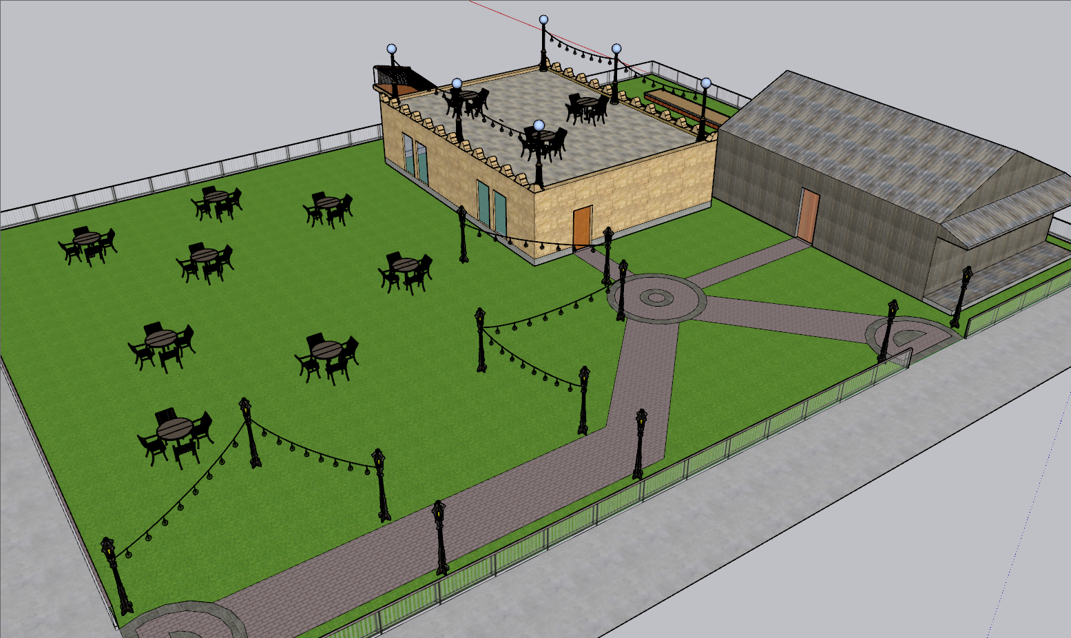
While exploring a town in Southern Texas that our team was assisting in their revitalization efforts, I noticed an overgrown lot across from a Catholic church. The church did not have much in the way of exterior space, crammed as it was between other buildings on the street; curious, I learned that this lot had been long abandoned. Two structures sat in disrepair amidst waist-high grass and dumped car parts.
I thought this space would be perfect for the neighborhood to utilize, so I sketched up some ideas and presented this model alongside the rest of our reports and recommendations. I imagined the space would belong to the church and its congregation, a perfect spot for community gatherings, games, potlucks... and the structures could be resurrected as a small community center and storage space, allowng even more possibilities.
The design is simple, but effective. The bulk of the lot is a fenced-in grassy lawn - preferably using natives, but Texas communities can be resistant to that suggestion - which acts as a large gathering space. Portable tables and chairs of various sorts can be kept inside the storage garage, wheeled out in whatever configuration is necessary along the brick paths. Said paths are lined with street lights, between which string lights are attached for added warmth, whimsy, and guidance; the string-lit poles open up once they reach the main lawn, creating a beautiful entryway at night.
Behind the small community center, which could be used for classes or other meetings, I set aside space for a community garden - many churches have one, and I personally think a community garden adds a certain charm to any neighborhood. Finally, although I could not be sure of the structural integrity of it without further investigation, I set a roofttop patio on top of the community center; a charming space for small gatherings, lit by string lights, and also a place one could give speeches from! It adds a bit of grandeur to weddings or outdoor mass that I think would be appreciated, while still being fun.