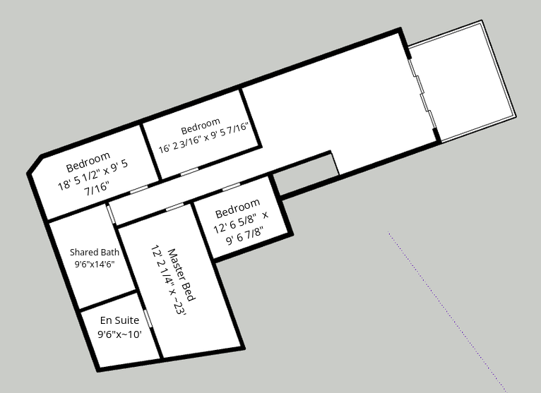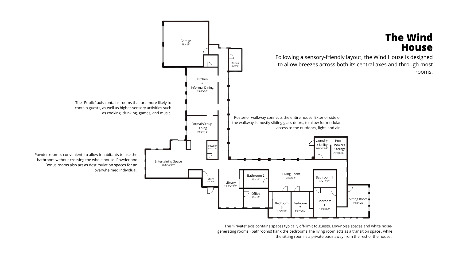
Click the floorplan to view the full-size image.
The Wind House is inspired aesthetically by the works of Hiroshi Nagai, one of my favorite painters - strangely, as his style is wildly different from nearly every other painter I like! I don't usually go for this sort of boxy, 80s-modernist buildings, but something about his paintings makes them so desirable.
The house is built with sensory and social stimulation in mind. The two axes separate the social spaces from the private spaces, and then each room becomes more stimulating (along the y-axis) or less stimulating (along the x-axis) the further you get from the front door. It's like a graph, in house form. Of course, you can't control exact amounts of stimulation or socializing in any given room, so they are arranged by expectation of stimulation. Noise is the sensory stimulation I am particularly concerned with, probably because my own sensory sensitivities are focused on sound above all else (aka I do not function well when it's loud). The garage is set at the back because 1) that is where cars, which are loud, go, 2) that is where people tend to work with power tools and work out when the cars are not present, which is loud, and 3) I think the trend of moving the garage to the forefront of the American house is ugly and I just don't want to do it.
So, why is it called the Wind House? The house is designed to allow fresh air through nearly the entire building. Doors and windows in the two axes can be opened to create breezeways through the building. The long chain of sliding glass doors at the back (presumably, but not necessarily, looking over a pool. Hiroshi Nagai, remember) can be opened to let an even greater amount of air inside the building. The remaining windows can all be opened as desired. It is perhaps not the best house for someone who likes to keep loose stacks of papers laying about, but the house can be closed up as desired. I am considering storm shutters, as are common in Japanese apartments, for greater weather safety (although that would give it, let's say, "bunker vibes").
I will be working on a 3d rendering of the space, but for now it remains a floorplan.
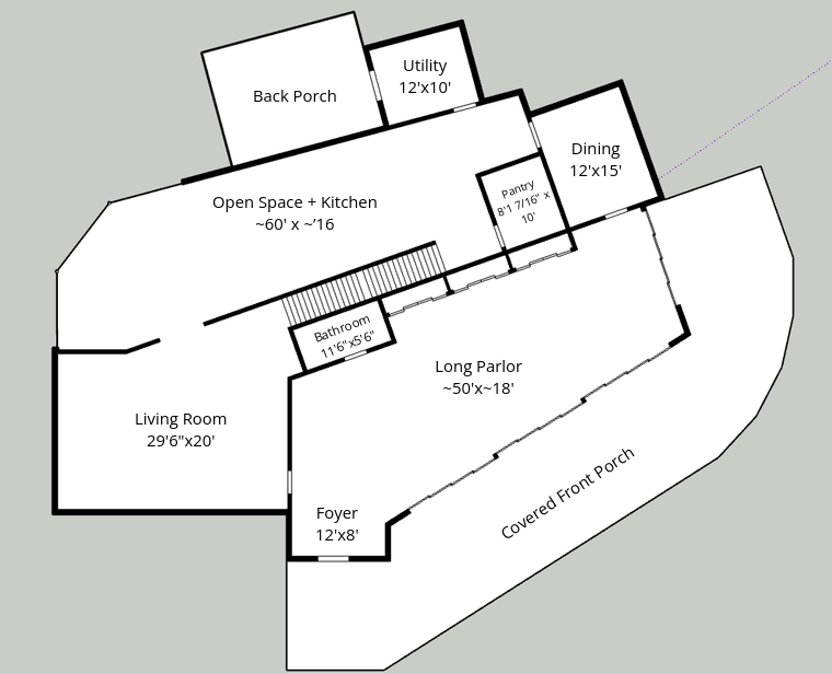
This was a weird project, and probably one I'll revise in the future.
The O(&)N House takes inspiration from Victorian manor floorplans, although you may struggle to see how. I liked the way those floorplans made distinctions between spaces based on a continuum of privacy and community, and wanted to imitate that. From the entrance, there are two paths: to the left is the private room for the family, to the right is the "long parlor" for parties and other gatherings. The front-facing wall of the "long parlor" is made up of sliding doors, which can be opened to extend the space onto a covered porch. From here, family and/or guests may enter the dining room for group dinners. There is a door from there to the kitchen... well, to an extremely extended open space which includes the kitchen. This, in turn, wraps back around into the private space, but I am just now realizing that entrance is through an open arch. That whole space will need to be redone.
The kitchen includes entryways to a pantry, the utility room (itself including an exit out the back) and the basement. The living room contains the stairway to the upper floor, where the rest of the private spaces rest.
Beyond the Victorian-inspired "circle of usage," the main idea behind this build was that it would alternate aesthetics from room to room. The "long parlor" and the kitchen are modern in design, while the dining room and the living room would be much more traditional. I liked this sort of Old-and-New combination as an artistic choice, though actually make it feel coherent would be a challenge in itself. Combine that with the strange proportions of the building and the whole thing needs another couple of passes. Still, I like the idea and wanted to share it.
Expect updates on this one in the future.